
RF engineering and wireless infrastructure · 2024
WZC Networking
Rebranding 25+ years of RF expertise into a sharper identity built for nationwide, mission-critical connectivity.
Visit live website
Rebranding 25+ years of RF expertise into a sharper identity built for nationwide, mission-critical connectivity.
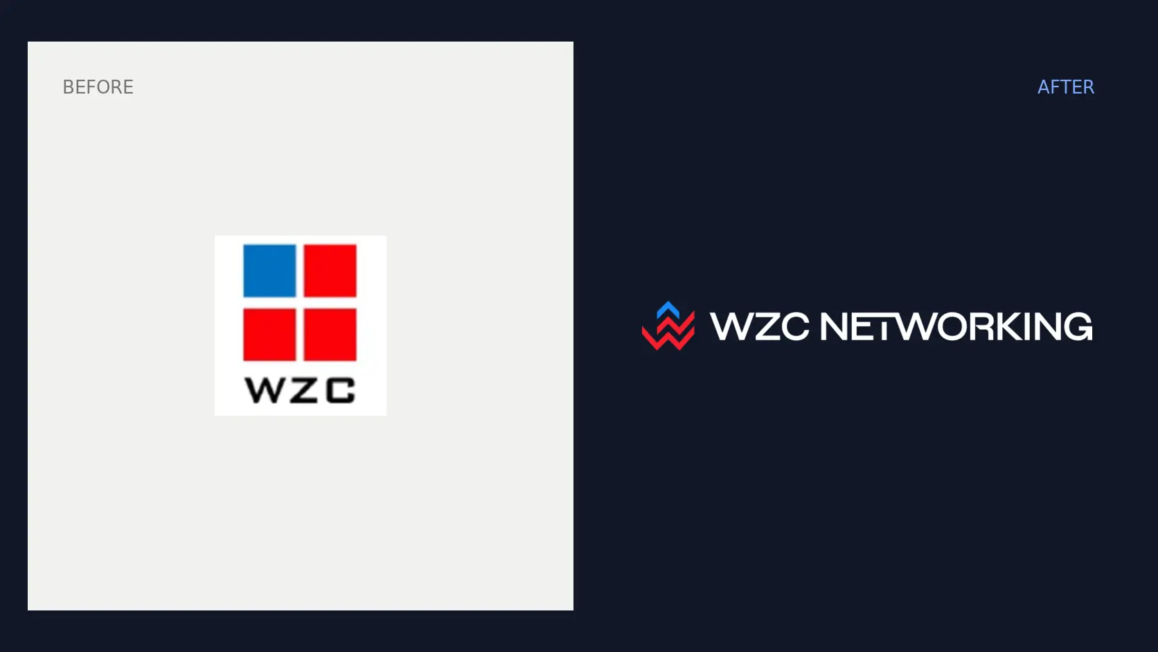
WZC Networking had grown from a specialist wireless operation into an experienced enterprise partner serving complex environments across the United States. Its old logo, built from four disconnected squares and a basic wordmark, no longer reflected the precision, reliability or scale of the company behind it. The rebrand needed to signal meaningful progress without abandoning the red and blue recognition WZC had built over decades.
Creative direction
The new direction turns connection into the core visual idea. Interlocking, upward-moving forms create an ownable W-shaped signal that suggests wireless movement, reach and continuous performance. The familiar colour equity remains, but a deeper navy, brighter blue and more decisive red give the brand the technical confidence expected from an RF engineering leader.
The identity system
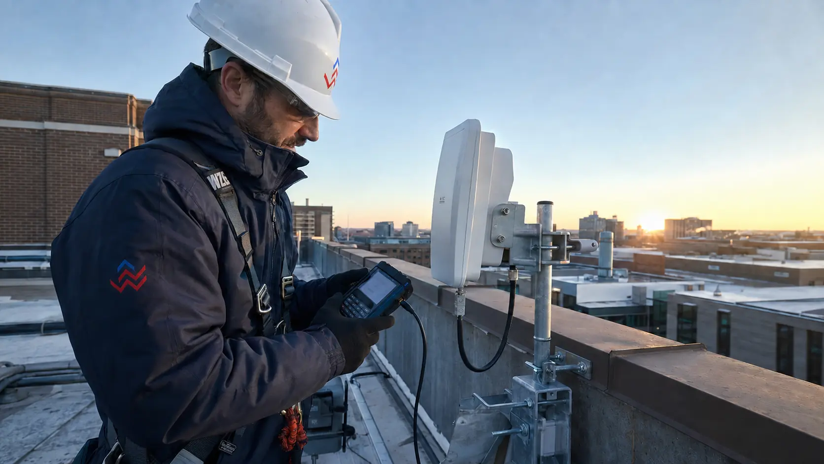
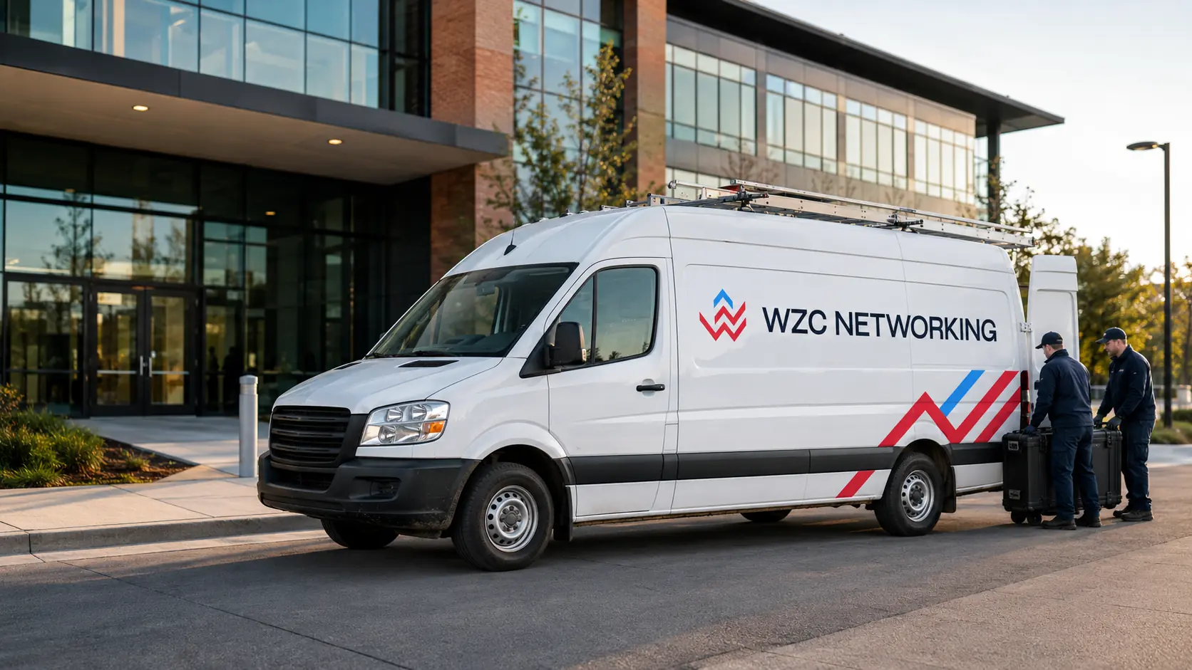
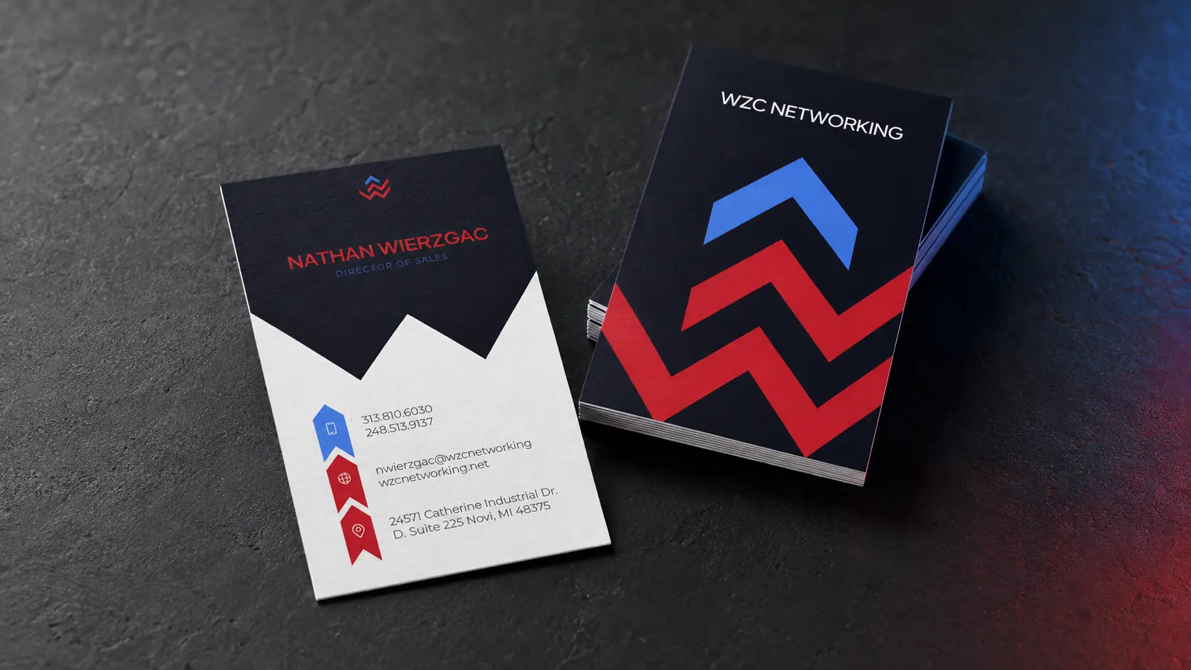
A streamlined symbol, contemporary wordmark and disciplined graphic system give WZC one recognisable voice across field uniforms, fleet vehicles, trade shows, business cards and technical communication. Every element was designed to remain clear in real working environments, from a small embroidered mark to large-format signage.
The outcome
The redesigned identity closes the gap between how WZC looked and the level of work it delivers. It gives the company a credible, scalable platform that feels established enough for enterprise decision-makers and modern enough to support nationwide growth.


Need a transformation like this?